
17 Color Trends 2027 That Feel Fresh, Chic & Unexpected
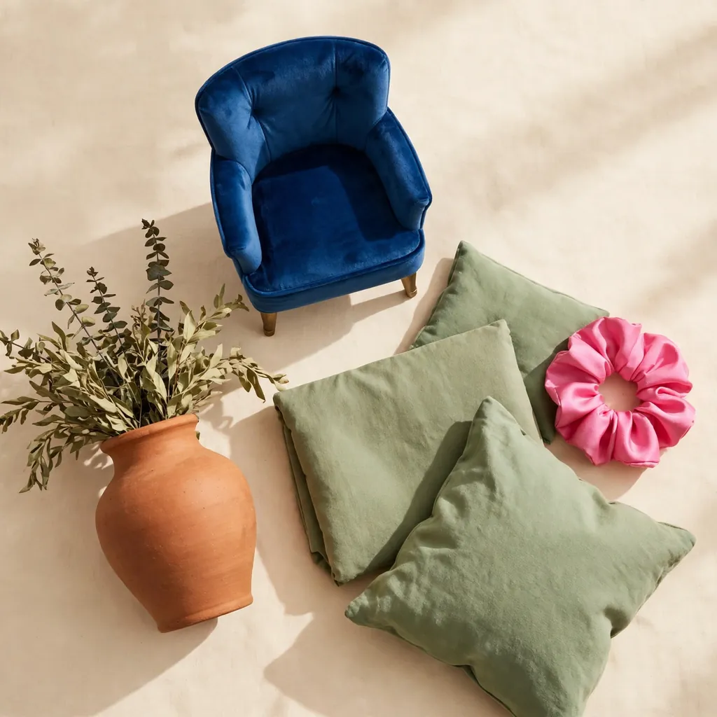
The trending colours for 2027 are Luminous Blue, Meadowland Green, warm Clay, Energy Orange and Pop Pink, joined by paint favourites Webster Green, Celery and Grounded olive, plus Russet, Peaceful Lilac, Maize, Festival Fuchsia, Poppy Red, Rose Earth and deep Coffee Brown. Forecasters WGSN and Coloro named Luminous Blue their 2027 Colour of the Year, while Benjamin Moore, Sherwin-Williams and Behr all chose greens for 2027. The overall story is simple: warm, nature-led shades form the base, then one confident, saturated colour does the talking. Cool grey is quietly retiring, and in its place come colours with more feeling — shades that work just as beautifully on a coat or a manicure as they do on a kitchen wall. Use this guide to find the versions that suit your home, your wardrobe and your skin tone best.
1. Luminous Blue
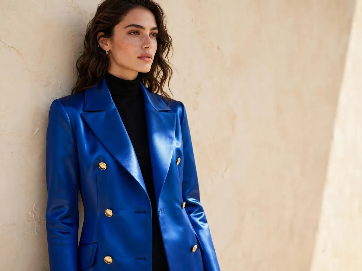
Luminous Blue is the headline shade of 2027: a rich, saturated sapphire with the depth of lapis lazuli, named Colour of the Year 2027 by WGSN and Coloro. It is confident without being cold, and glows against warm neutrals in a way navy never manages. In fashion, wear it as a cobalt-leaning coat, a knit dress or glossy loafers; the spring 2027 runways were full of it. At home, try it on a velvet sofa, kitchen island or a single dramatic wall. On nails, it makes a striking short, square manicure. Pair it with warm cream, camel, brushed brass and Clay below. It feels fresh because it replaces safe navy with something ancient, jewel-like and unapologetically joyful.
2. Meadowland Green
Meadowland Green is one of WGSN and Coloro’s key spring/summer 2027 colours: a fresh, leafy mid-green that sits between grass and herb garden. It is brighter and cleaner than the sage tones of recent years, which is exactly why it feels new. Wear it as a silky midi skirt, a relaxed blazer or a knitted polo, and let it lift black, denim and white basics. In interiors it is lovely on lower kitchen cabinets, a reading-chair upholstery or a tiled splashback, especially with pale oak and stone. Meadowland nail polish feels spring-like without going pastel. Pair it with cream, chocolate brown and a small hit of Pop Pink for contrast.
3. Celery
Celery, Sherwin-Williams’ 2027 Colour of the Year (SW 6421), is an airy, herbal yellow-green — think the tender heart of the vegetable rather than anything neon. It brings light into rooms the way a window does, making it a favourite for kitchens, bathrooms and small hallways. Because it is pale, it behaves almost like a neutral, but with far more personality than white. Try it on walls with warm white trim, or on a painted vanity. In fashion, Celery-toned linen shirts, cardigans and scarves soften tailoring beautifully, and as a nail colour it reads clean and modern. Pair it with natural timber, rattan, warm white and deeper Webster Green for a layered, botanical scheme.
4. Webster Green
Benjamin Moore’s 2027 Colour of the Year, Webster Green HC-130, is a classic, balanced mid-to-deep green drawn from the brand’s historical collection — its first true green pick in over a decade. Balanced between blue and yellow, it feels established rather than trendy, like the green of library doors and heritage front doors. It shines on kitchen cabinetry, built-in shelving, dining-room walls and exterior doors. In fashion, look for it in wool coats, corduroy and leather accessories; it flatters almost every skin tone. As a nail shade it is elegant and slightly moody. Pair Webster Green with warm off-white, antique brass, natural oak and the spiced browns in Benjamin Moore’s own Color Trends 2027 palette for a collected, timeless look.
5. Clay
Clay is the warm heart of the 2027 palette — a sun-baked terracotta with a dusty, mineral softness. WGSN and Coloro list Clay among their spring/summer 2027 key colours, and Pantone’s New York Fashion Week autumn/winter palette includes a close cousin, Muted Clay. This version is quieter and more wearable than the bright terracottas of a few years ago. At home it warms living rooms as plaster-effect walls, linen sofas or handmade ceramics. In fashion, Clay suede jackets, wide-leg trousers and knit dresses feel rich without shouting, and a clay-toned blush or lipstick flatters warm complexions. Pair it with cream, olive, denim blue and unglazed pottery tones. It feels unexpected because it works as both a neutral and a statement.
6. Energy Orange
Energy Orange is 2027’s exclamation mark: a vivid, sunlit orange from WGSN and Coloro’s spring/summer key colours, echoed on the Paris spring 2027 runways where orange was repeatedly named the season’s standout. This is not shy tangerine — it is direct, optimistic and daring. The chicest way to wear it is in one strong piece: a tailored coat, a slip dress, glossy heels or a structured bag against an otherwise neutral outfit. At home, keep it to accents — a lacquered side table, cushions, art or a painted front door. Orange nail polish is the lowest-commitment entry point and looks superb on short nails. Pair Energy Orange with warm white, Clay, chocolate and, for the brave, Luminous Blue.

7. Pop Pink
Pop Pink is the joyful pink of spring/summer 2027, one of WGSN and Coloro’s five key colours and a shade that also flooded the London runways in bubblegum form. It is clear, bright and confident — closer to a sweet-shop pink than a sugary pastel. Wear it as a satin skirt, an oversized shirt or a knit twinset, or start with a bag or ballet flats. At home, Pop Pink is best in doses: a painted stool, cushions, a lampshade or fresh peonies in a Clay vase. In beauty, it translates into the return of brighter blush and a glossy pink lip. Pair it with red for a fashion-forward clash, or cool it down with grey, white and Meadowland Green.
8. Festival Fuchsia
Where Pop Pink is playful, Festival Fuchsia is dramatic. Named in Pantone’s New York Fashion Week autumn/winter 2026/2027 palette, it is a vivid purplish pink with real evening energy. Fuchsia has a gift for making simple silhouettes look expensive: a plain column dress, a tailored jumpsuit or a silk shirt in this shade needs almost no jewellery. At home, use it sparingly but boldly — a velvet armchair, a painted bookcase back or artwork in an otherwise calm room. It is also a standout nail and lip colour for parties. Pair Festival Fuchsia with black, charcoal, silver and deep green. It feels unexpected in 2027 because it brings back unapologetic glamour after years of muted everything.
9. Peaceful Lilac
Peaceful Lilac, a key colour in WGSN and Coloro’s autumn/winter 2027/28 forecast, is a soft, light purple with a calm, almost misty quality. It offers the romance of lavender but feels cleaner and more modern, floating between pastel and neutral. In fashion, it is beautiful in knitwear, fluid dresses and tailored suits, and it appeared across menswear as well as womenswear runways. At home, try it in a bedroom or nursery where its soothing character earns its name, or as painted cabinetry for a gentle surprise. Lilac nails and a wash of lilac eyeshadow are among the prettiest beauty looks of the year. Pair Peaceful Lilac with cream, soft grey, silver jewellery and Deep Green accents for balance.
10. Maize
Maize is WGSN and Coloro’s golden yellow for autumn/winter 2027/28: warm, grain-inspired and glowing rather than sharp. Think late-afternoon sunlight and ripe cornfields, not highlighter pens. It is a natural partner for the year’s earthy palette. Wear Maize as a chunky knit, a satin midi skirt or a brushed-wool coat, and notice how it warms navy, brown and black outfits instantly. In interiors it brightens kitchens and dining spaces as ochre-toned cushions, ceramics, a painted hutch or a full accent wall in sunnier rooms. A Maize manicure is an underrated delight in autumn. Pair it with Russet, cream, denim and natural wood for a harvest-rich scheme that never looks garish.
11. Butter Yellow
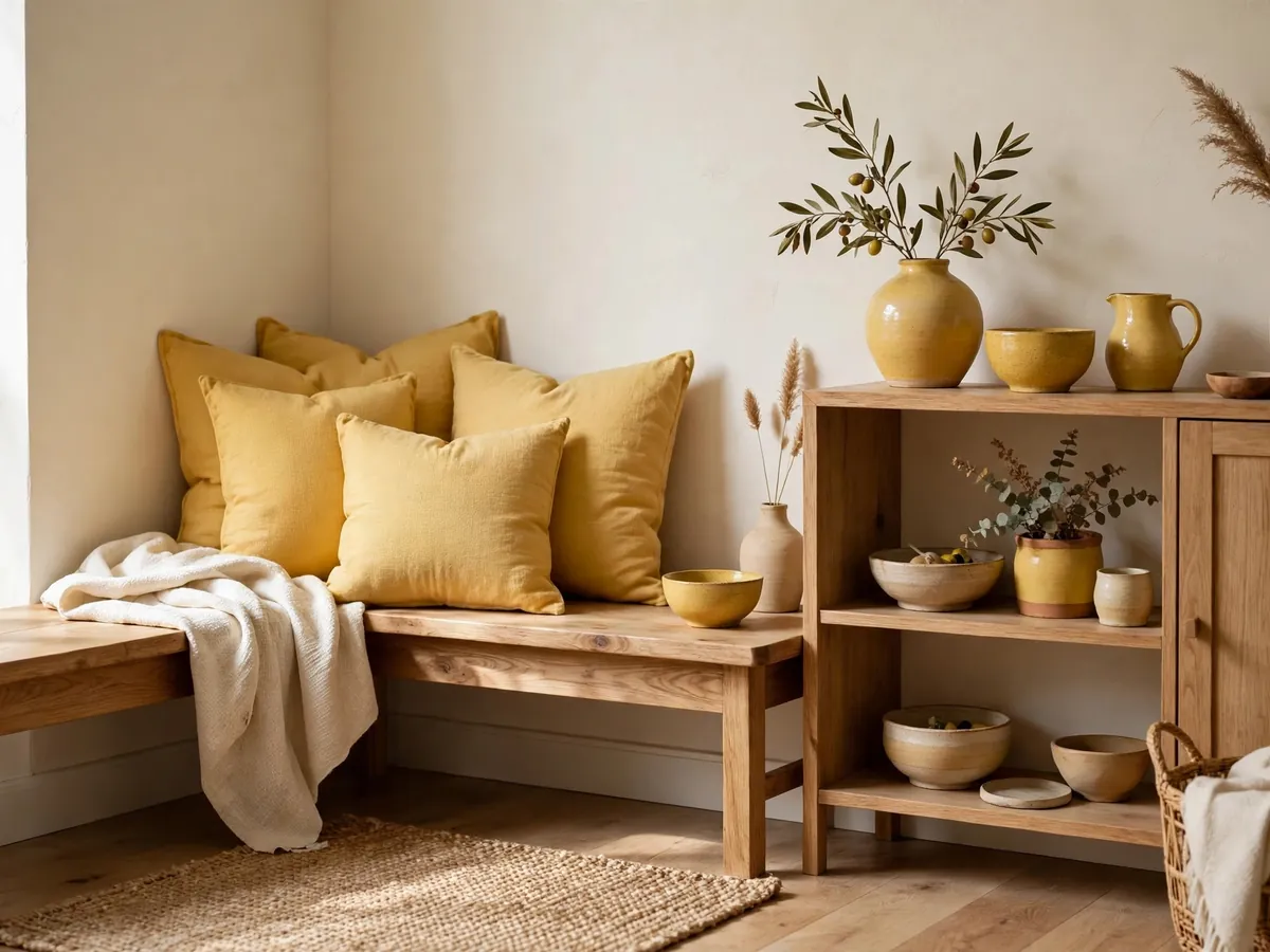
Butter Yellow is the soft-focus sister of Maize: a creamy, pale yellow that led the New York spring 2027 colour story alongside poppy red, and appeared at houses such as Chanel and Tod’s in an elegant buttercream form. It behaves almost like a neutral, bringing warmth where white feels stark and beige feels tired. A butter-yellow shirt dress, cardigan or silk blouse pairs effortlessly with denim, white and tan. At home, use it in linens, painted furniture or a sunny breakfast nook. On nails, creamy butter shades are a softer alternative to white. Pair it with Clay, soft blue and fresh green for a gentle, garden-party palette.
12. Poppy Red
Poppy Red is spring 2027’s power colour: a bright, warm, flower-fresh red that designers from Carolina Herrera and Proenza Schouler to Givenchy put at the centre of their collections. Unlike burgundy or brick, poppy is clear and energetic, and it instantly wakes up the navy, black, grey and denim in your wardrobe. The easiest entries are a red knit, glossy ballet flats, a structured bag or the classic red lip, now joined by poppy-red nails. At home, a little goes far — a painted sideboard, red glassware or a single piece of art. Pair Poppy Red with warm white, camel and butter yellow, or go bold against Luminous Blue. It feels fresh because, after years of quiet luxury, it is gloriously un-quiet.
13. Russet
Russet, a WGSN and Coloro key colour for autumn/winter 2027/28, is a warm reddish-brown inspired by autumn landscapes and ripening fruit. It sits between terracotta and chestnut, which makes it richer than Clay and easier to live with than bright rust. Forecasters link it to feelings of stability and confidence, and it shows: a Russet leather coat, suede boots or a tailored blazer looks grounded and expensive. At home it is superb on a feature wall, a reading chair or dining chairs. Russet nail polish and copper-toned makeup are autumn staples in the making. Pair it with Maize, cream, Deep Green and antique brass for a palette that feels like a walk through late-October woods.
14. Softened Blue-Grey (Cottage Door)
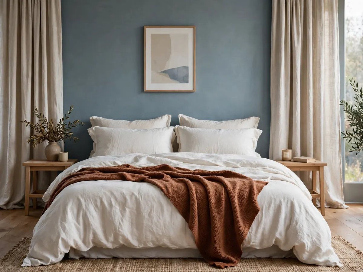
Not every 2027 blue is bold. Valspar’s 2027 Colour of the Year, Cottage Door, is a greyed, mid-tone blue with both warm and cool undertones, described by the brand as a colour that welcomes you home. Benjamin Moore’s palette tells the same story with watery Nelson Blue. This softened blue family works almost like a neutral: calm in bedrooms, elegant on front doors and cabinetry, and endlessly compatible with warm woods. In fashion, washed chambray, slate-blue knits and stonewashed denim carry the mood. On nails, dusty blue-grey is the chic alternative to greige. Pair it with warm white, Russet, natural linen and Meadowland Green. It feels fresh because it finally gives blue-lovers a softer, lived-in option.
15. Rose Earth
Pink grows up in 2027. Graham & Brown named Rose Earth its 2027 Colour of the Year, C2 Paint chose the warm, earthy Pueblo, and Benjamin Moore’s palette includes Wild Aster, a graceful pink softened with grey. Together they define an earthy, mineral rose — pink with its sweetness replaced by soil, stone and dusk. In interiors, Rose Earth tones make grown-up bedrooms, plaster-pink living rooms and surprisingly sophisticated bathrooms. In fashion, dusty rose tailoring, suede and satin read elegant rather than girly, plus blush and nail shades that flatter nearly everyone. Pair Rose Earth with cream, Coffee Brown, olive and aged brass. It feels unexpected because it proves pink can be the most serious colour in the room.
16. Grounded Olive
Behr’s 2027 Colour of the Year, Grounded, is a mossy olive green with brown undertones — and it captures where green is heading: deeper, muddier and more architectural than the sages of the past. Pantone’s autumn/winter palette agrees with Burnt Olive, a richly layered green. Grounded olive is a workhorse in interiors, covering kitchen islands, built-ins, mudrooms and exteriors with equal ease. In fashion, olive utility jackets, knit dresses and leather bags are the quiet backbone of a 2027 wardrobe, and olive nails are a chic neutral alternative. Pair it with warm white, Clay, Russet and blackened bronze. It feels fresh because it treats green as a neutral — one with far more soul than grey ever had.
17. Coffee Brown
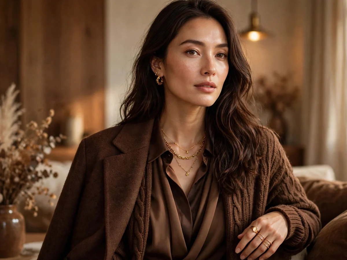
The deepest anchor of 2027 is Coffee Brown: Dunn-Edwards named French Press Coffee its 2027 Colour of the Year, Benjamin Moore’s palette adds spiced Antique Copper and burgundy-toned Townsend Harbor Brown, and chocolate was among the most-worn colours on the spring 2027 runways. This is brown with richness — espresso, cocoa and polished wood rather than flat tan. Wear it head-to-toe in mixed textures, or as a leather trench, knit dress or suede boots — warmer and kinder than black on most complexions. At home, Coffee Brown cabinetry, doors and upholstery create instant cocooning. Pair it with Butter Yellow, Peaceful Lilac, cream and gold jewellery. It feels unexpected because the shade we once called dull is now the height of chic.
How to Wear and Use These Trends Without Overdoing It
Start with the 80/20 rule: let warm neutrals and one grounded shade (Clay, Grounded Olive or Coffee Brown) make up most of a room or outfit, then spend the remaining 20 per cent on a single vivid — Luminous Blue, Energy Orange or Poppy Red. In fashion: one trend-colour garment, everything else familiar. Nails, lipstick or a bag are the cheapest test drives before committing to a coat or a wall of paint. At home, always sample paint on the actual wall and check it in morning and evening light, because shades like Celery shift noticeably. Buy for your own colouring and light first — the best trend is the version that flatters you.
Frequently Asked Questions
What is the Colour of the Year for 2027?
There are several. WGSN and Coloro named Luminous Blue their 2027 Colour of the Year. Benjamin Moore chose Webster Green, Sherwin-Williams chose Celery, Behr chose Grounded, Valspar chose Cottage Door and Dunn-Edwards chose French Press Coffee. Pantone had not announced a 2027 pick when this guide was written.
What colours are in style for 2027?
The leading colour trends for 2027 are Luminous Blue, Meadowland Green, Webster Green, Celery, Clay, Energy Orange, Pop Pink, Festival Fuchsia, Peaceful Lilac, Maize, Butter Yellow, Poppy Red, Russet, softened blue-grey, Rose Earth, Grounded Olive and Coffee Brown. Warm, nature-inspired shades form the base, with one saturated accent colour on top.
Is grey going out of style in 2027?
Cool grey is fading as the default neutral in most 2027 forecasts. Warmer, more characterful neutrals are replacing it: warm off-whites, golden tans, Clay, olive and softened blue-greys. Warm grey still works as a supporting shade, but rooms and outfits built entirely on cool grey now tend to look dated rather than fresh.
Which 2027 colour trends work best for interiors?
For walls and cabinetry, the most livable picks are Celery, Webster Green, Grounded Olive, Cottage Door blue-grey and the Rose Earth family, with Coffee Brown for doors and furniture. Use Luminous Blue, Energy Orange and Festival Fuchsia as accents — a sofa, an island, a painted bookcase — unless you love a bold, colour-drenched room.
How can I try the 2027 colour trends on a small budget?
Start with paint samples, cushion covers and beauty: nail polish in Luminous Blue, Poppy Red or butter yellow costs very little and tests a colour against your skin. One accessory — a Pop Pink bag, Energy Orange flats or a lilac scarf — updates outfits you already own.
Do the 2027 colour trends suit every skin tone?
Yes — the palette spans warm and cool families. Warm complexions glow in Clay, Maize, Russet and Coffee Brown; cooler complexions suit Luminous Blue, Peaceful Lilac and blue-grey. Mid-tone greens such as Webster Green and Meadowland Green flatter almost everyone. Keep very bright shades in accessories if they sit less comfortably near your face.
Conclusion
The colour trends of 2027 ask for more courage and more warmth: grounded greens and earthy browns underneath, then one luminous, joyful shade on top. You do not need all 17 — pick two or three, test them in your light and against your skin, and let them refresh what you already own. Save this guide for your next shopping trip, and tell us in the comments: which 2027 colour will you try first?