12 Gorgeous Kitchen Cabinet Colors That Look High-End
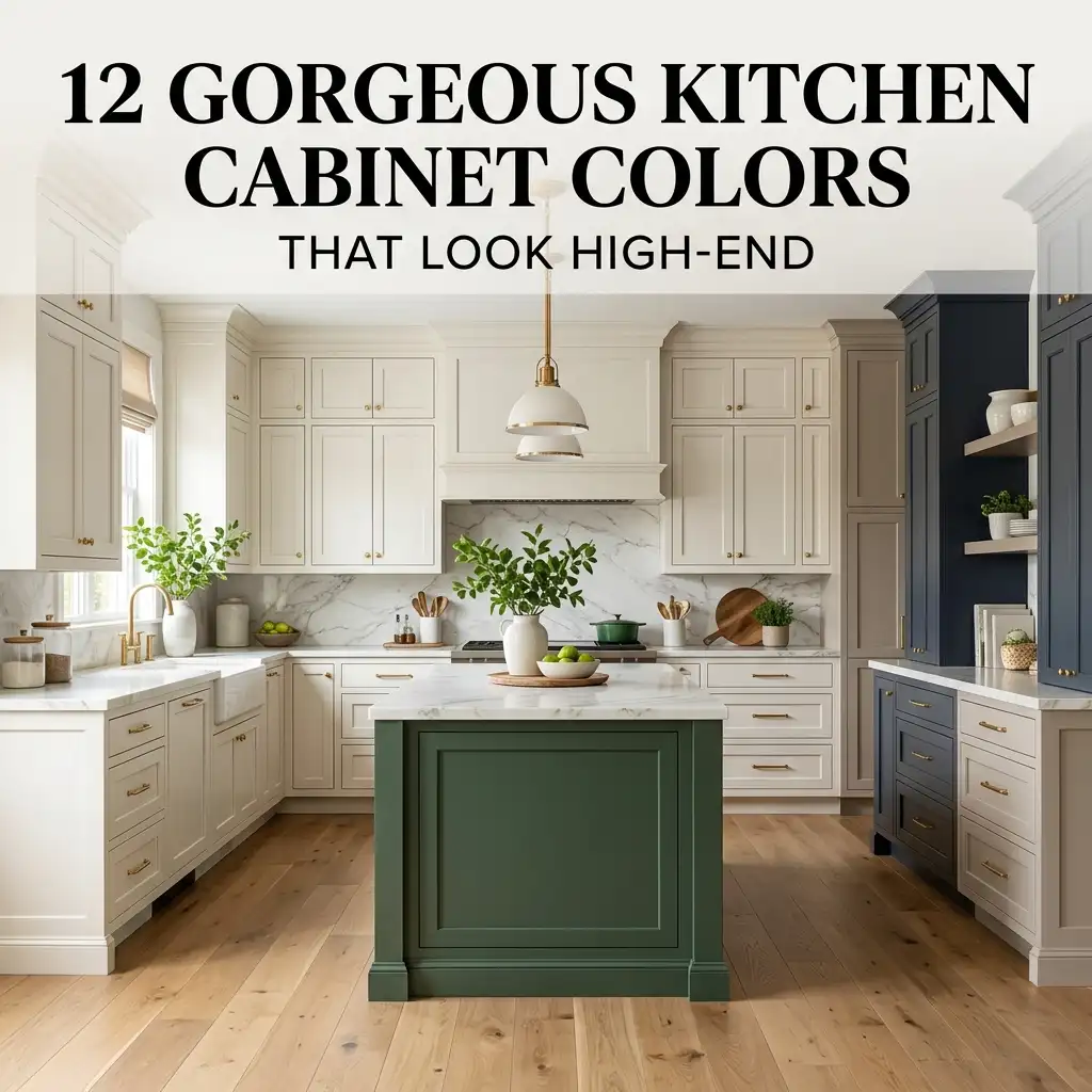
Your kitchen doesn’t need a massive renovation budget to look expensive. Sometimes, the biggest transformation starts with one simple decision: choosing the right cabinet color. A beautiful cabinet shade can make ordinary countertops look richer, brighten a dark kitchen, and give the whole room that polished designer feel.
I’ve always noticed how dramatically cabinet color changes a kitchen. Paint the same cabinets creamy white, deep green, or warm navy, and suddenly you get three completely different personalities. So, if your kitchen feels a little flat right now, why not let the cabinets do the heavy lifting?
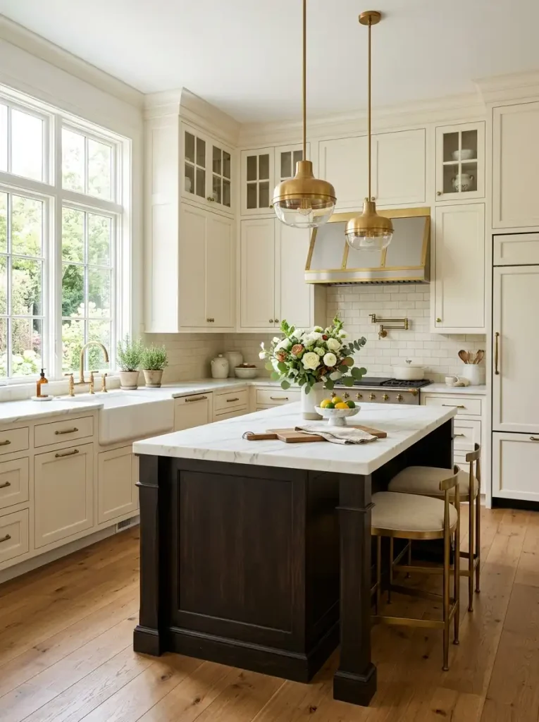
1. Warm Cream
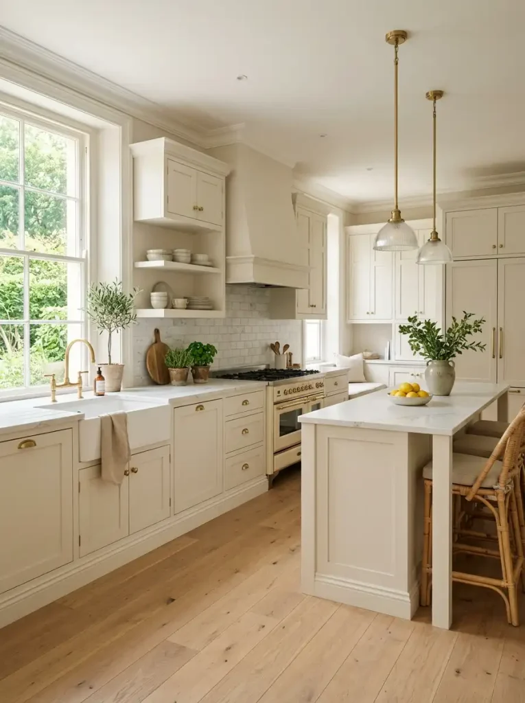
Warm cream brings an effortless elegance to kitchen cabinets without creating the stark feeling that some bright whites can produce. This shade works beautifully with natural wood, brass hardware, marble-look countertops, and warm flooring. It also reflects plenty of light, which makes it especially useful in smaller kitchens.
I love cream cabinets because they create a soft backdrop rather than demanding attention. You can add colorful artwork, patterned rugs, or dramatic lighting without making the kitchen feel chaotic. Warm cream works especially well when you want timeless cabinets with a modern touch.
Pair cream cabinets with:
- Brushed brass hardware
- Warm white walls
- Natural oak accents
- Cream or beige countertops
Ever wondered why some white kitchens look cozy while others look cold? Warm undertones often make the difference.
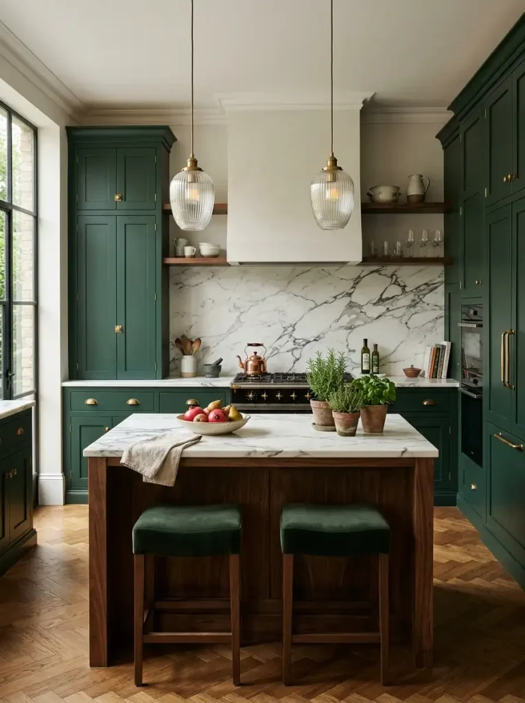
2. Deep Forest Green
Forest green cabinets can give your kitchen an instantly sophisticated personality. The rich shade adds depth while still connecting the room to natural colors. Pair it with creamy countertops and warm metal hardware, and you can create a kitchen that feels both luxurious and welcoming.
Deep green works particularly well on shaker-style or flat-panel cabinets. It also looks gorgeous alongside natural wood because the two materials create an earthy contrast.
For a high-end finish, keep the surrounding colors relatively quiet. Let the green cabinets become the statement rather than competing with several other bold elements. A few ceramic accessories or leafy plants can complete the look without overdoing it.
3. Classic Navy Blue
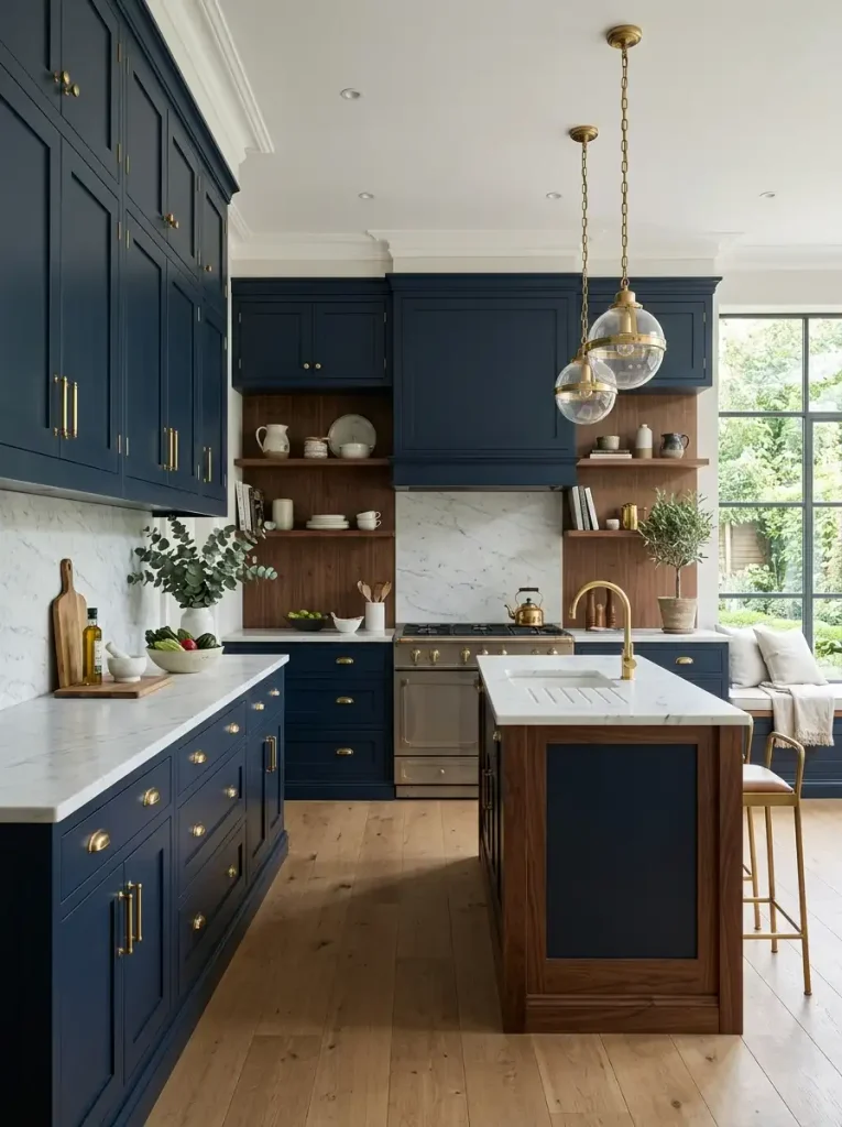
Navy blue remains one of my favorite cabinet colors for creating a polished kitchen. It gives you the drama of a dark color without the intensity of black. Plus, navy pairs beautifully with white, brass, chrome, marble, and natural wood.
Try navy on a kitchen island if you don’t want to commit to an entire room of dark cabinetry. A white perimeter with a navy island creates a classic designer-style contrast that feels intentional.
Navy cabinets work especially well in kitchens with plenty of natural light. If your room lacks windows, balance the darker shade with lighter walls, countertops, and flooring.
4. Soft Sage Green
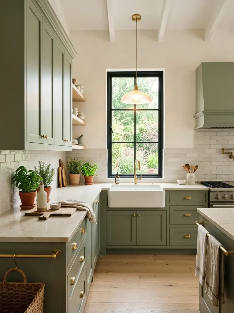
Sage green gives kitchen cabinets a relaxed, sophisticated appearance. The muted green feels fresh without looking overly trendy, which makes it easier to live with for years. It also works beautifully with warm whites, light woods, natural stone, and aged brass.
I’d choose sage if you want color but don’t want your kitchen to shout for attention. The softness allows the cabinets to add personality while keeping the room calm.
Use sage cabinets with:
- Light oak flooring
- Cream countertops
- Brass or bronze hardware
- Warm white walls
Sage green creates a high-end look through subtlety, and honestly, that restraint often makes a kitchen look more expensive.
5. Charcoal Gray
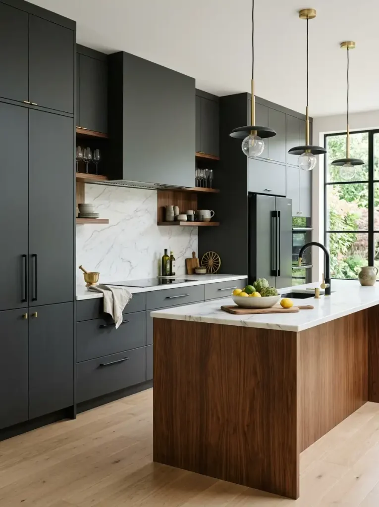
Charcoal gray gives kitchen cabinets a sophisticated, architectural feel. The deep neutral creates drama while remaining easier to coordinate than some stronger colors. You can pair it with white countertops for contrast or use warmer materials to soften the overall appearance.
This color works especially well in contemporary kitchens. Matte black lighting, stainless steel appliances, and simple hardware can push the design toward a sleek modern aesthetic.
If you worry that charcoal might make your kitchen feel too dark, use it strategically. Try charcoal on the lower cabinets or island while keeping upper cabinets light. This approach creates contrast without visually shrinking the room.
6. Greige
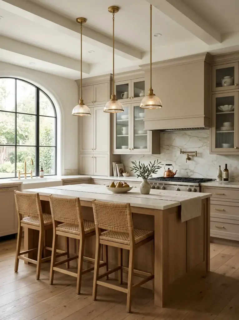
Greige combines gray and beige to create one of the most flexible neutral cabinet colors. It works beautifully when you want something softer than gray but more sophisticated than basic beige. The shade can adapt to both warm and cool elements depending on its undertones.
Greige cabinets look fantastic with quartz countertops, natural stone backsplashes, oak flooring, and mixed-metal hardware. They also transition easily between traditional, transitional, and contemporary styles.
FYI, undertones matter a lot with greige. Always test a sample in your actual kitchen because daylight and nearby finishes can change how the color appears.
A well-chosen greige can make your kitchen feel custom-designed without relying on dramatic color.
7. Warm Taupe
Warm taupe offers another elegant option for homeowners who want neutral cabinets with personality. The earthy shade creates a cozy atmosphere while still looking refined. It works particularly well with creamy countertops and natural materials.
Taupe cabinets can make a large kitchen feel more inviting because the color adds visual warmth. You can also use the shade in a smaller kitchen if you pair it with light walls and good lighting.
Add brushed brass pulls for a slightly glamorous finish. Choose black hardware instead if you prefer a sharper modern look.
Warm taupe works best when you want your kitchen to feel sophisticated, comfortable, and timeless.
8. Moody Black
Black cabinets can look incredibly luxurious when you balance them correctly. The deep color creates instant drama and gives simple cabinet shapes a more architectural appearance. Matte black finishes often feel especially sophisticated because they reduce visual shine.
If you love bold interiors, black cabinetry can make your kitchen look like a high-end restaurant or boutique apartment. Pair it with warm wood, creamy stone, or metallic accents to prevent the space from feeling too severe.
I wouldn’t automatically paint every cabinet black in a tiny, poorly lit kitchen. Instead, consider a black island or lower cabinets and keep the rest lighter.
Want that designer contrast? Combine black cabinets with warm oak and soft lighting.
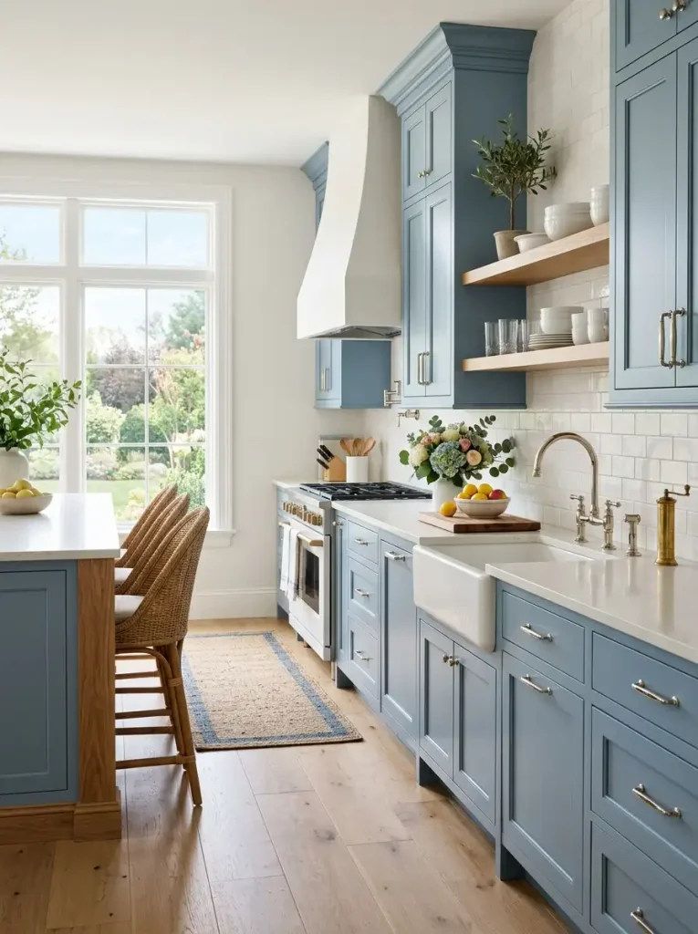
9. Dusty Blue
Dusty blue offers a softer alternative to navy. The muted shade brings color into the kitchen without creating too much contrast. It looks especially beautiful with white countertops, natural wood, and aged brass hardware.
This color can create a relaxed coastal feeling, but you don’t have to turn the entire kitchen into a beach house. Keep the accessories sophisticated and let the cabinet color provide the subtle character.
Dusty blue also works nicely in traditional kitchens with raised-panel or shaker cabinets. The muted undertone keeps the color elegant rather than overly playful.
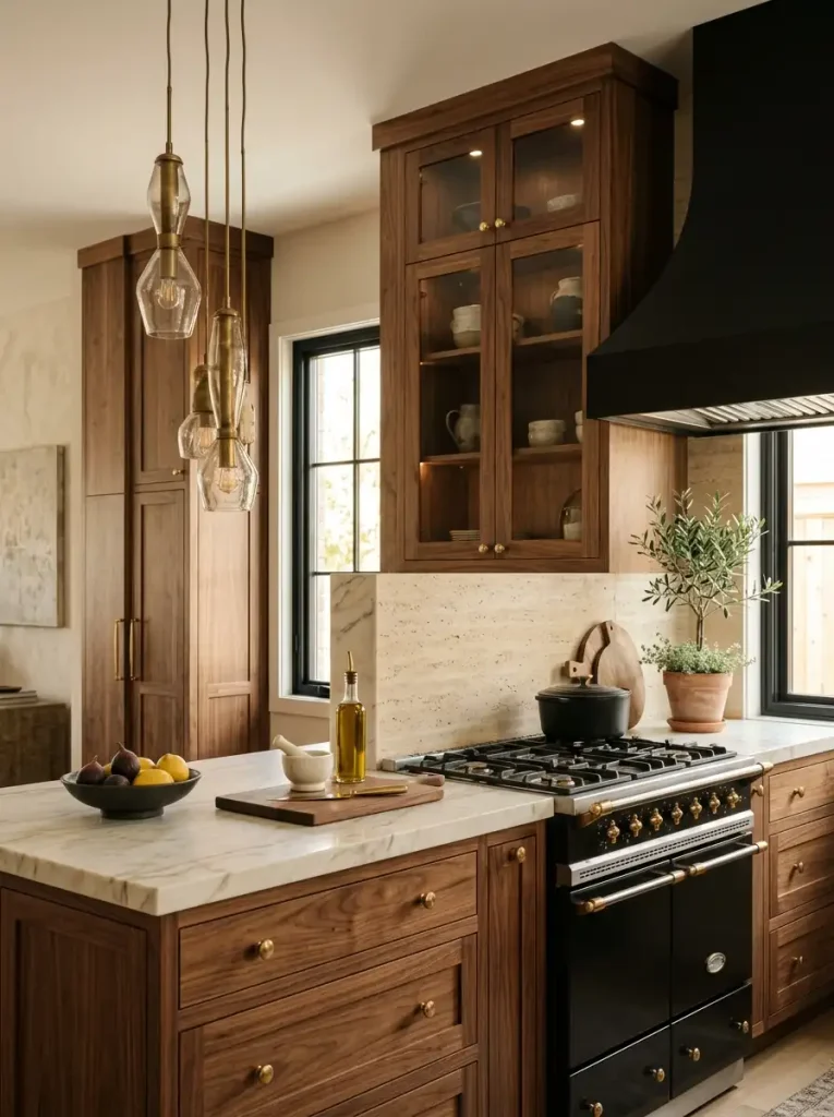
10. Rich Walnut Brown
If you love natural materials, rich walnut cabinetry can create a seriously expensive-looking kitchen. The deep brown tone highlights the natural grain and gives the room warmth and depth. Unlike painted cabinets, walnut brings texture into the design automatically.
Pair walnut with light countertops to create contrast. Creamy quartz, pale stone, or white surfaces can keep the kitchen from feeling too dark.
You can also mix walnut lower cabinets with painted uppers. This combination creates visual variety while maintaining a sophisticated palette. Add simple hardware and let the wood grain take center stage.
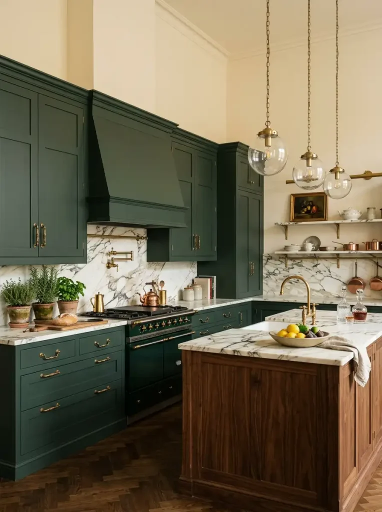
11. Soft Blackened Green
Blackened green gives you the best parts of green and charcoal in one sophisticated shade. It looks almost black in low light but reveals a subtle green undertone when sunlight hits the surface. That changing quality gives the cabinets plenty of depth.
This color works beautifully in moody kitchens with brass hardware and creamy stone. You can also pair it with warm wood to create an organic, upscale atmosphere.
Because the shade already carries plenty of personality, keep the backsplash relatively simple. A restrained surrounding palette allows blackened green cabinets to look intentional and luxurious.
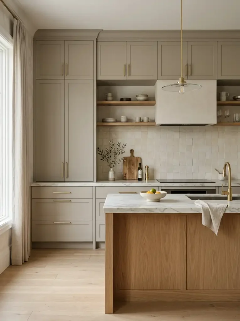
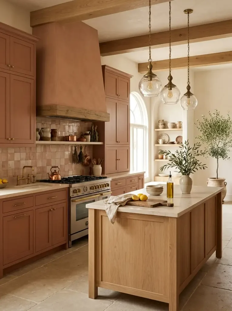
12. Elegant Mushroom
Mushroom tones bring a soft earthy quality to kitchen cabinets. The shade sits somewhere between beige, gray, and taupe, which gives it plenty of versatility. It can make a kitchen feel warm without pushing the room toward a traditional beige-heavy look.
Mushroom cabinets pair beautifully with creamy quartz, natural oak, bronze hardware, and handmade-look tile. The combination feels relaxed but polished, almost like a boutique European kitchen.
If you want a cabinet color that feels different without becoming difficult to decorate around, mushroom deserves serious consideration. It gives you personality while keeping the overall room flexible.
How to Choose the Right High-End Cabinet Color
Choosing a beautiful color matters, but choosing the right color for your specific kitchen matters even more. Start by studying the natural light throughout the day. A shade that looks perfect online might look completely different under your kitchen’s lighting.
Next, consider your existing finishes. Look at your flooring, countertops, backsplash, appliances, and hardware before selecting a cabinet color. Your cabinet color should connect these elements rather than fight with them.
Think about your overall style too:
- Choose cream or greige for timeless elegance.
- Choose forest green or sage for an organic look.
- Choose navy or dusty blue for classic sophistication.
- Choose charcoal or black for dramatic modern style.
- Choose walnut or mushroom for warm, earthy luxury.
Always test paint or finish samples directly in the kitchen. Check them in morning sunlight, afternoon light, and artificial lighting before making the final decision.
How to Make Any Cabinet Color Look More Expensive
Even the most beautiful cabinet color can look ordinary if you pair it with mismatched finishes. Fortunately, a few simple choices can make almost any shade feel more luxurious.
Start with hardware. Quality-looking cabinet pulls and knobs can dramatically elevate the overall appearance. Brass adds warmth, black creates contrast, and chrome or nickel gives the kitchen a cleaner contemporary finish.
Lighting also matters. Install attractive pendant lights over an island and use under-cabinet lighting to highlight countertops and backsplashes.
Finally, avoid overcrowding your counters. A few beautiful cutting boards, ceramics, plants, or decorative objects can add personality, but excessive accessories can quickly make an expensive kitchen look cluttered.
Cabinet Color Mistakes to Avoid
One of the biggest mistakes involves choosing a color solely from a small digital image. Screens can distort undertones, and your kitchen’s lighting can change everything. Always test samples before committing.
Another mistake involves ignoring the rest of the room. Your cabinet color should complement the countertop and flooring rather than exist as an isolated design decision.
You should also avoid following trends blindly. A trendy color might look amazing today, but your kitchen should match your taste and lifestyle first. After all, you have to live with those cabinets long after Pinterest moves on to its next obsession.
Final Thoughts
The right kitchen cabinet color can completely change the personality of your home. From warm cream and elegant greige to forest green, navy, charcoal, walnut, and mushroom, you have plenty of options that can create a polished high-end appearance.
You don’t need every expensive finish in the showroom. Focus on a cohesive color palette, attractive hardware, thoughtful lighting, and quality-looking materials, and your kitchen can feel far more luxurious.
If I had to choose one strategy, I’d start with the mood you want rather than the trend you see everywhere. Do you want warm and cozy, dramatic and modern, or soft and sophisticated? Pick that feeling first, then choose the cabinet color that brings it to life. Your kitchen will thank you—and your wallet might, too. 🙂